
Happy July 4th! If you’re in the U.S. I hope you are having a fun celebration with family and friends. Here is Texas it means days and days of firework fun which is great until the kiddos need to get to bed or the dogs need to go outside and the fireworks are still going off at 1am.
Today it’s time for another fun challenge over at the Flower Blog and this month it is all about pastels.
We also have another great prize this month sponsored by Bev at Uniko who is giving away one in stock stamp set.
We also have another Guest Designer this month, Michelle Lupton, so make sure to check out her beautiful card along with all the other gorgeous cards from the Design Team.
Here is my card this month for pastels.

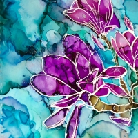
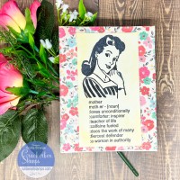
I stamped the Unity image, Blow Your Own Mind, on watercolor paper with Versamark ink and gold heat embossed it. I then used some Prima pastel watercolors for the flower. I started with a light rose and then used lilac rain to add some shading in the flower.

Once the flower was dry I played around with the background using several shades of blue and green , I add watered down drops of color and the spritzed the background to get the colors to run together. I then let the layer dry and repeated the process until I liked the background look.

Once the background was dry I added the sentiment from Reverse Confetti in the same gold heat embossed.
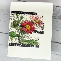
I also played around with my Zig Clean Color Brush pens since this image was so fun to color up.

I white heat embossed the image and played around with dotting and blending the color onto the petals.

It was an interesting color combo and and I used a yellow and peach for the background to help the white embossing pop.

I finished with a sentiment from Reverse Confetti stamped in Versfine ink and heat clear embossed.
Here are my two pastel cards, which color combo do you prefer? Thanks for stopping by and I hope you have a wonderful day!

Supplies
*Listed below are the products I used and contain affiliate links at no cost to you. Thank you for your support! All products were personally purchased.
 Reverse Confetti – The Most Beauty Shop at: EH |
 Strathmore – Bristol Smooth Shop at: BL | SC | DB | AZ |
 Strathmore – Watercolor Paper Pad Shop at: EH | BL | SC | DB | AZ |
 Pretty Pink Posh – Marshmallow Confetti Mix Shop at: EH |
 Brutus Monroe – Embossing Powder – Ultra Fine – Gilded Shop at: EH | BL | AZ |
 Brutus Monroe – Metallic Embossing Powder – Alabaster Shop at: EH | BL | SC | AZ |
 Tsukineko – VersaMark Ink Pad Shop at: EH | BL | VI | SC | AZ |
 Kuretake – ZIG – Clean Color – Real Brush Marker Shop at: EH | BL | SC | DB | AZ |
 Prima Watercolors – Pastel Dreams Shop at: SC | AZ |
|
 Hero Arts – Wagner – HT400 Precision Heat Tool Shop at: SC | AZ |
 MISTI Stamping Tool Shop at: EH | SC | AZ |
 Tonic Studios – Tim Holtz – Glass Media Mat Shop at: EH | BL | SC | AZ |


As you can see I’m commenting in reverse order so you know how I can say kudos to you for making two cards each time, Ericka. These are both so pretty and it’s great how you kept working that blue background. It has so much movement.
LikeLike
Thank you so much Bobby
LikeLike
Nice! I really like these flower “portraits”.
LikeLike
Thank you Helen!
LikeLike
Both cards are gorgeous, Ericka! Love the texture you’ve achieved in the background of the first card. But my favorite is the second card as it has a softer and lovelier look!
LikeLike
Wow, what beautiful pastel cards Ericka! I love your soft water colouring and the shading is so perfect too. Another stunning creation mf 😉 hugs Viv xx
LikeLike